Overview
Improving home energy tracking
Encored provides innovative energy monitoring solutions through Artificial Intelligence (AI) and Machine Learning (ML). As the sole product designer, I owned the end-to-end process in designing an app that helps users better track their home energy system.
Business Goals
Create an MVP of a new energy tracking app to test with users
Focus on user conversation and activation rate
Create a new UI and brand for this product

The Problem
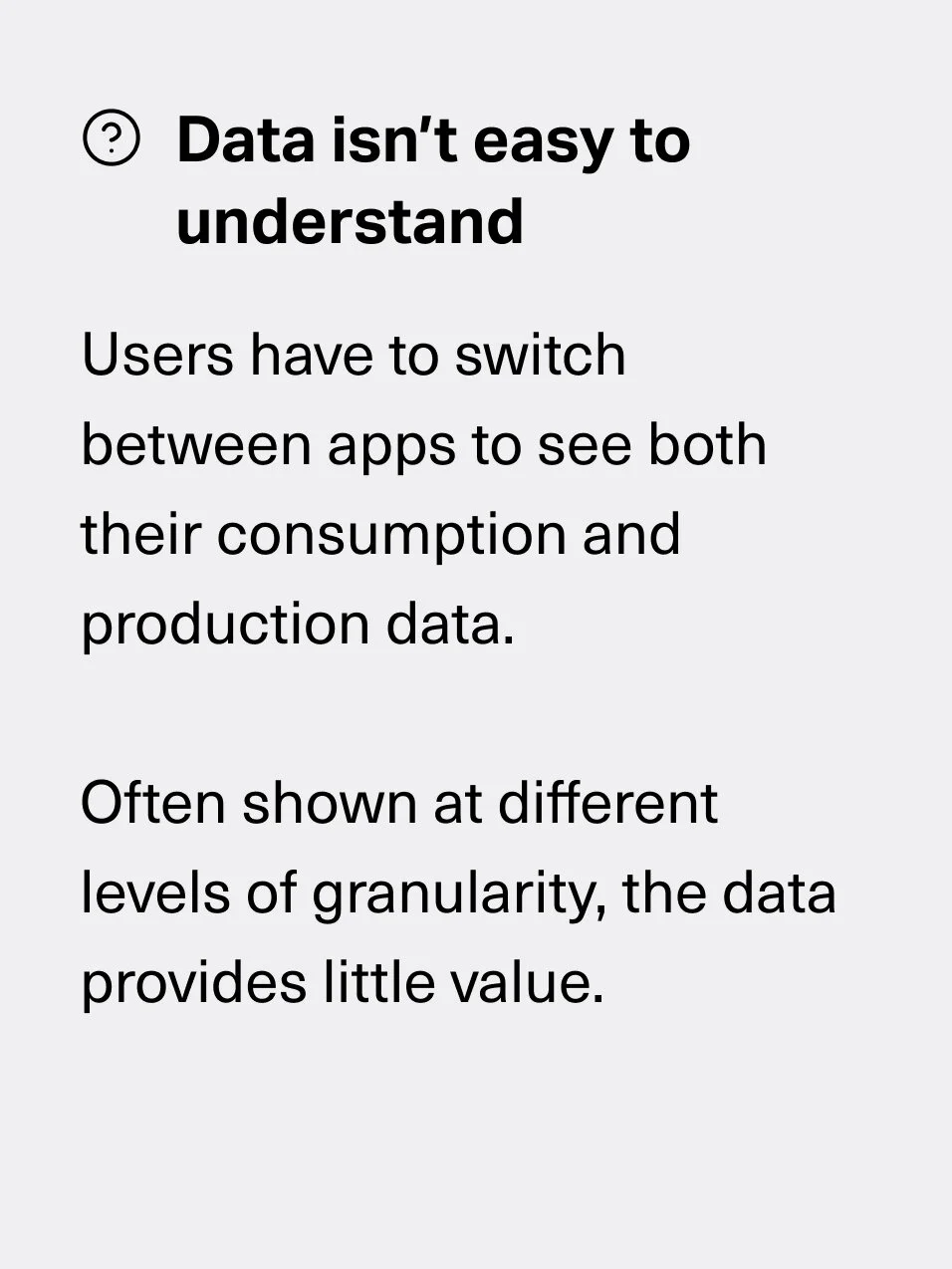
Users are getting fragmented insights on their home energy data
As energy tracking can involve various types of hardware that collect data differently, users with solar systems are not able to effectively track both their production and energy consumption activity. They are currently either getting inconsistent insights from using multiple software to track their data due to varying levels of granularity or they’re unable to comprehensively track their energy system at all.
How might we help users effectively track home energy production and consumption data to optimize energy usage?

The Process
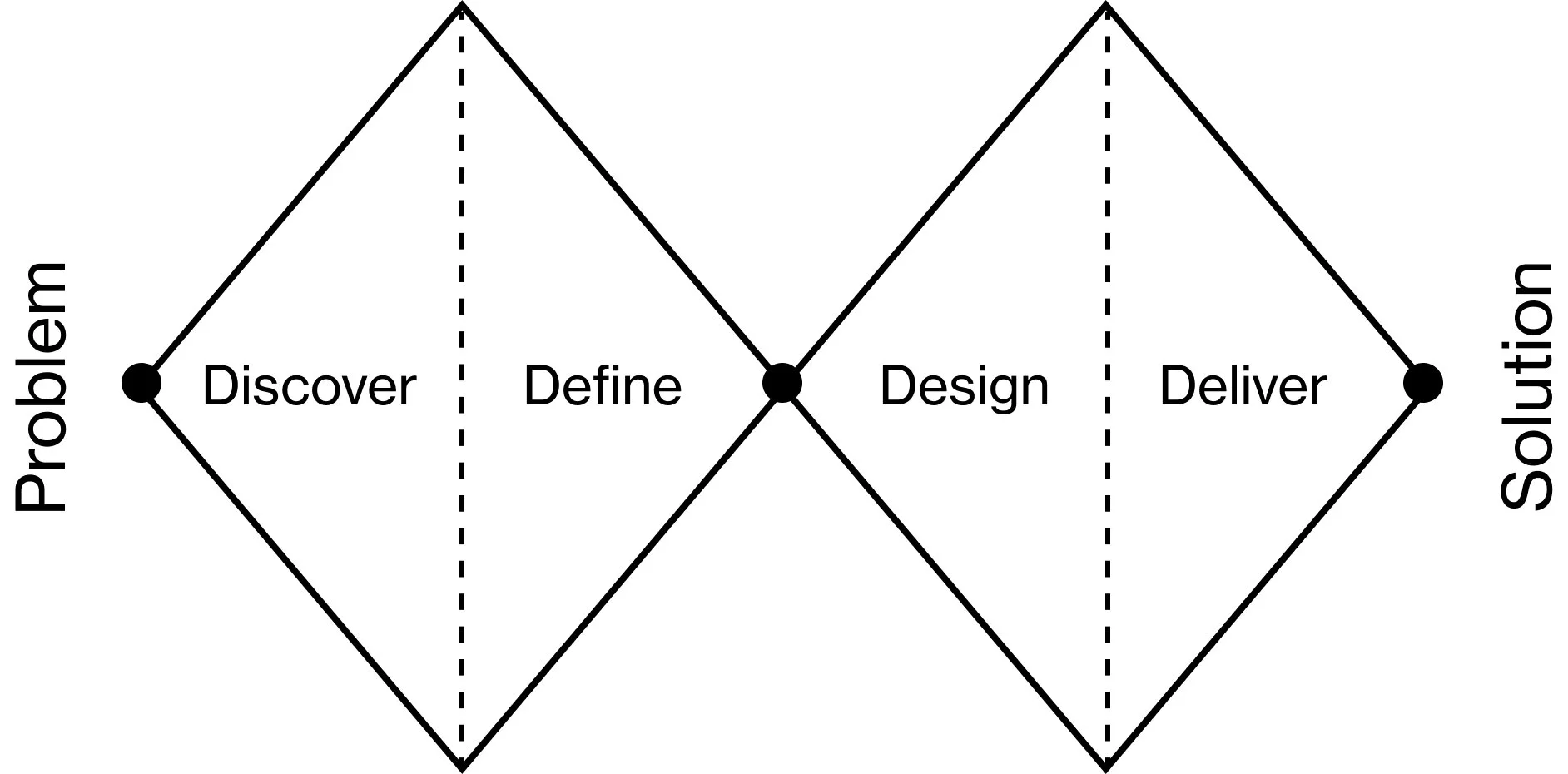
Framework to brainstorm problems and solutions
For this project, I used the double diamond design process. As we were looking to build a new app, I wanted to focus on having the mindset of exploring the market, users, problems, and potential solutions before converging.
Competitive Research
Outdated interfaces and barriers to entry
To better understand what’s currently in the market and where there may be potential opportunities, I started off by conducting research on several different competitor apps. I identified key features along with strengths and weaknesses to identify gaps in the market that we could serve.
Here were my key takeaways:
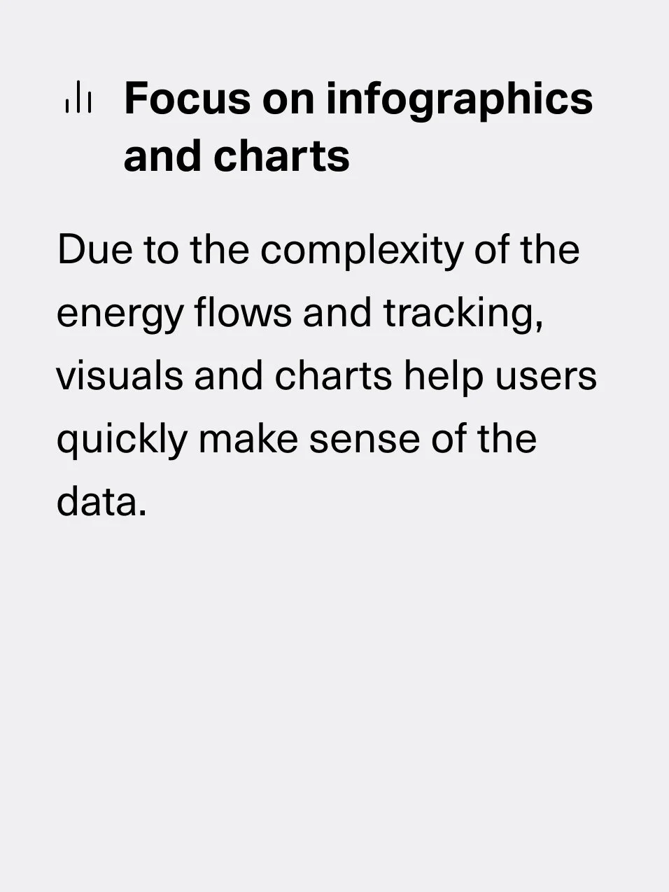
Use of colors and visuals helps to differentiate system elements and simplify the complexity of it
For the more technical apps, the amount of data shown were often overwhelming
Lack of curated insights makes it difficult to understand how a solar system is performing
It’s not easy to see your solar production trends over various time periods

User interviews
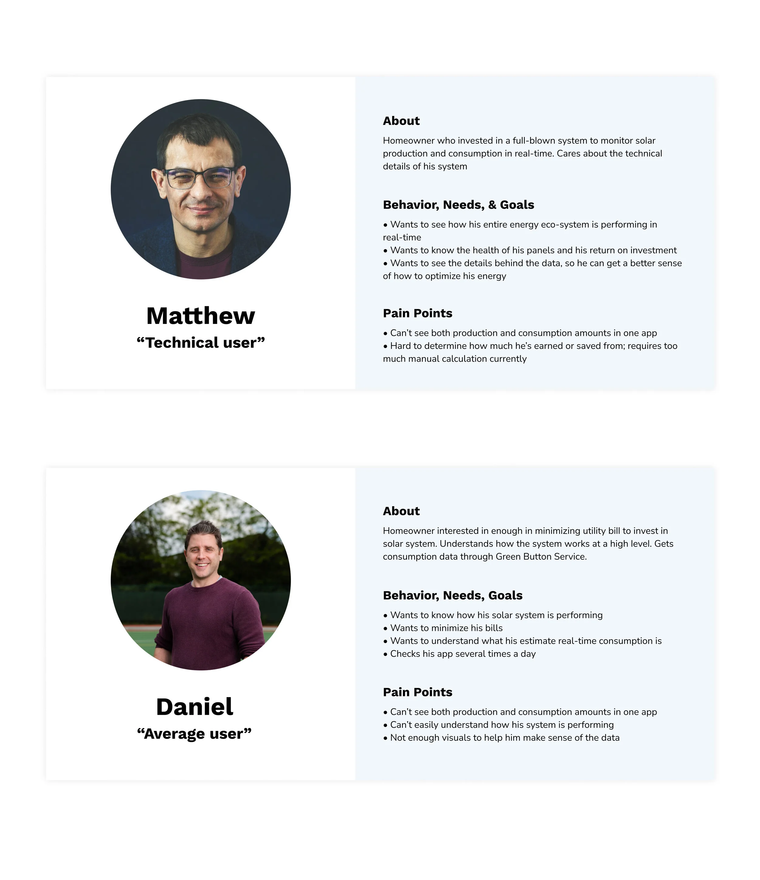
Users aren’t able to get a complete snapshot of their energy system
To validate this potential market opportunity, I proposed, recruited, and conducted user interviews to understand what the pain points were with existing solar production tracking apps. Users screenshared the apps they currently use and asked some questions around their goals, the content on the app, how they navigate it, and current pain points.
With the insights, I created personas to bring alignment to the team on who we’re designing for and what the main considerations were when brainstorming and assessing solutions.
Redefining the problem
More than solar production tracking
From our initial research, we hypothesized that there was a need to improve solar production tracking. However, upon talking to our users, we learned that the bigger issue was a lack of end-to-end energy tracking, from energy consumption to solar production, especially for users who don’t own a real-time consumption tracking device.
Because of this, users were either getting fragmented insights from having to use multiple software to track their energy or they were only tracking part of their energy system, making a lot of the data they were receiving useless. With this new insight, we pivoted our strategy and focused on creating an energy tracking app where users could get a comprehensive look at their home energy system.
flows
Designing how users navigate the app
After prioritizing and deciding on features to design, I created flows for the different features to ensure we designed an intuitive and user-friendly experience. This helped us think through potential friction points and clearly visualize how the user could navigate and use our app.
Design iterations
From high-level ideas to concrete solutions
After establishing the structure and flow of the app, I went on to sketch and wireframe potential designs. I presented designs to the team to get feedback throughout the process and iterated until we had concrete solutions we could test with users.
Early in the process, I used the crazy 8 sketch technique to come up with different types of solutions and push beyond my initial idea. From there, I focused on creating mid-fidelity wireframes on the most promising solutions and fleshed out more of the details on the layout, content, and flow. On the right are versions of the dashboard, onboarding, and setting flows.
Validation testing
Users like details and customization
I conducted usability testing to get feedback on the designs and to make improvements before moving into implementation. I had users complete certain tasks and asked for their thoughts on the flow and content, noting areas that worked well and areas that could be changed. Here are the main takeaways:
5/5 users were satisfied with onboarding flow
5/5 users understood the dashboard and trends tabs
3/5 users felt the energy usage schedule met their needs
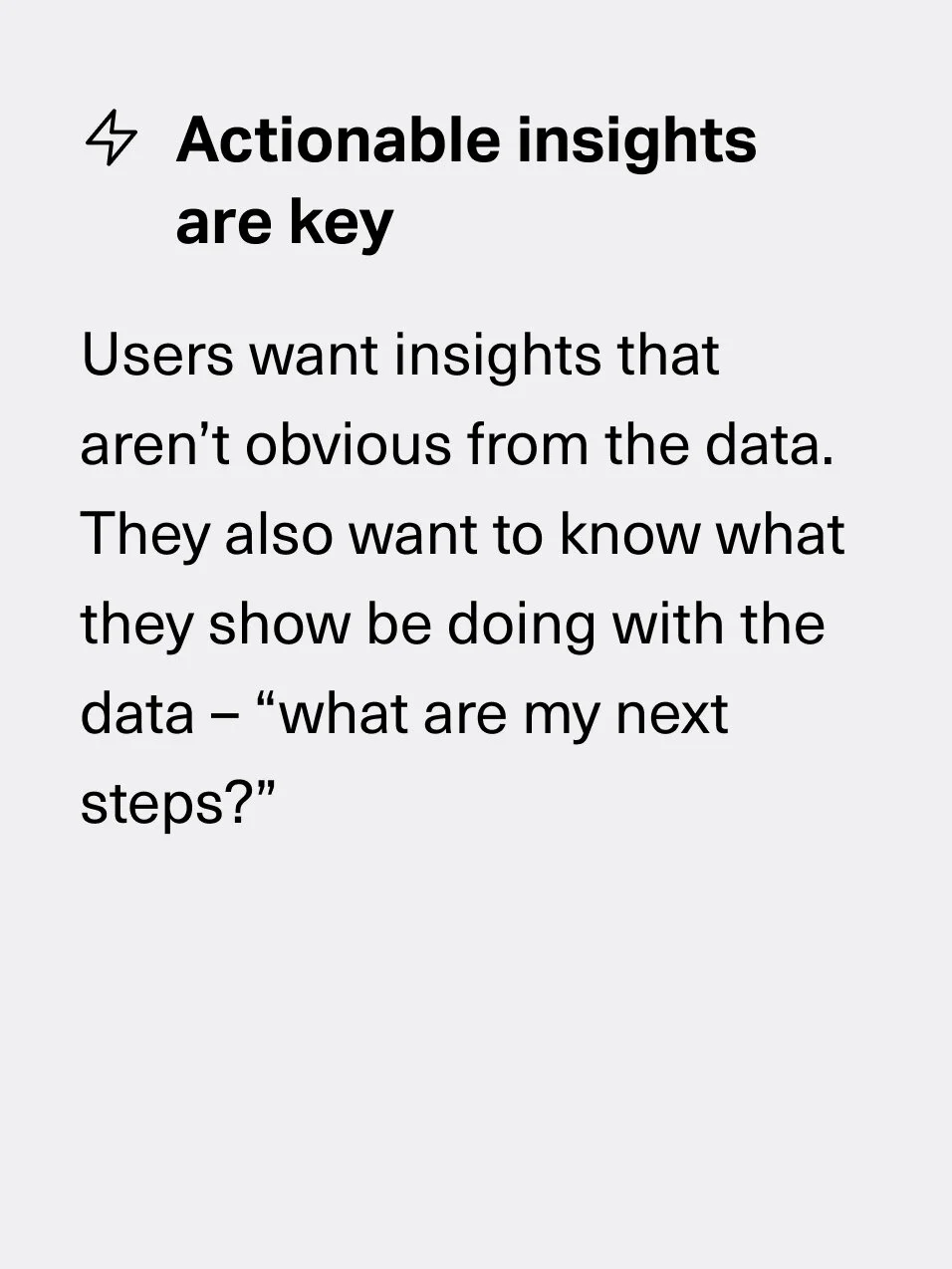
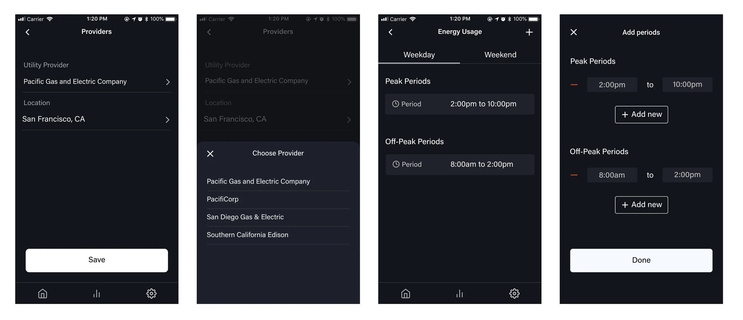
One piece of feedback we received was they liked the level of details on the trends page and wanted to see more for the day’s activity. Another piece of big feedback we got was that users loved being able to set peak and off-peak periods in their energy usage schedule, but wanted more customization to tailor to their specific needs. With this feedback, I designed additional solutions focusing on adding more details and options for custom schedules.
Before
After
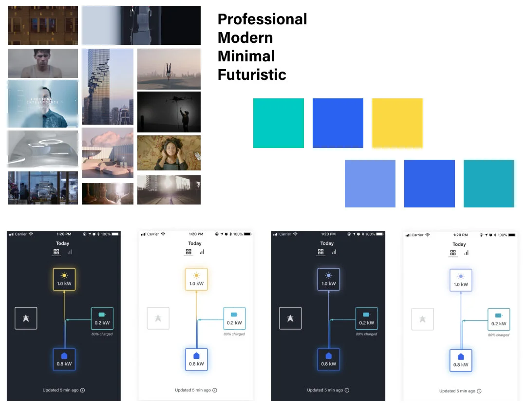
Visual Design
Creating a brand and design system
As a new product, Encored wanted something that was new and refreshing but still aligned with the company’s ethos. I worked with the team to identify words we resonated with. I then created a mood board, color palettes, and typography pairings to create this product’s brand identity. We went with the first palette, which used modern hues but was still easy to identify the different components in an energy system. The dark theme helped solve contrast issues for accessibility and also aligned better with our brand identity.
I also created a design system to ensure efficiency in design and development and cohesiveness in the product as it grows.

Final Designs
An MVP that meets user and business needs
The final designs consisted of:
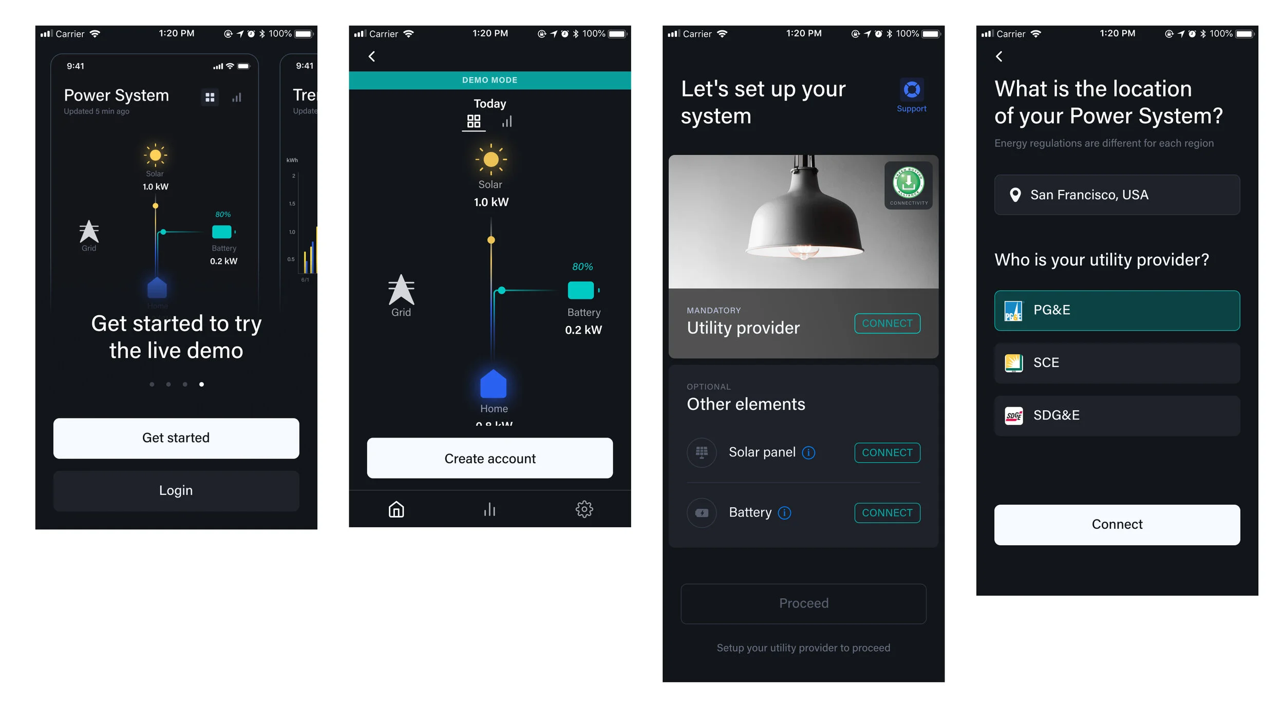
A seamless flow to onboard and set up your system
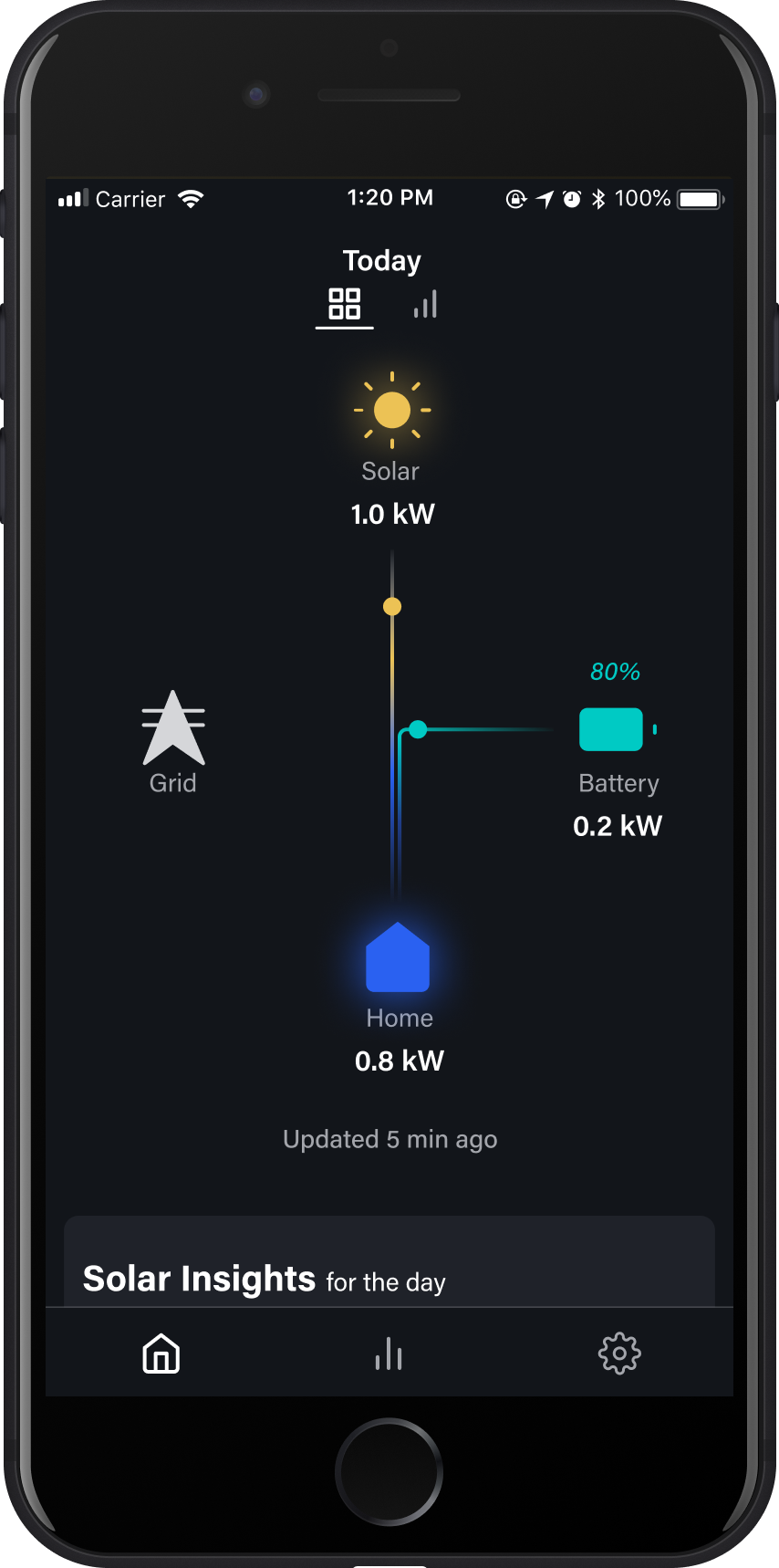
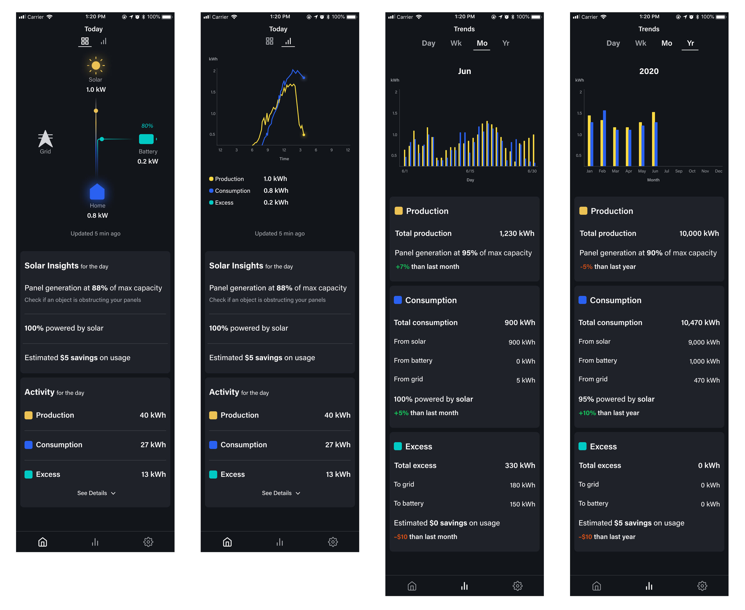
Energy tracking in real-time with actionable insights
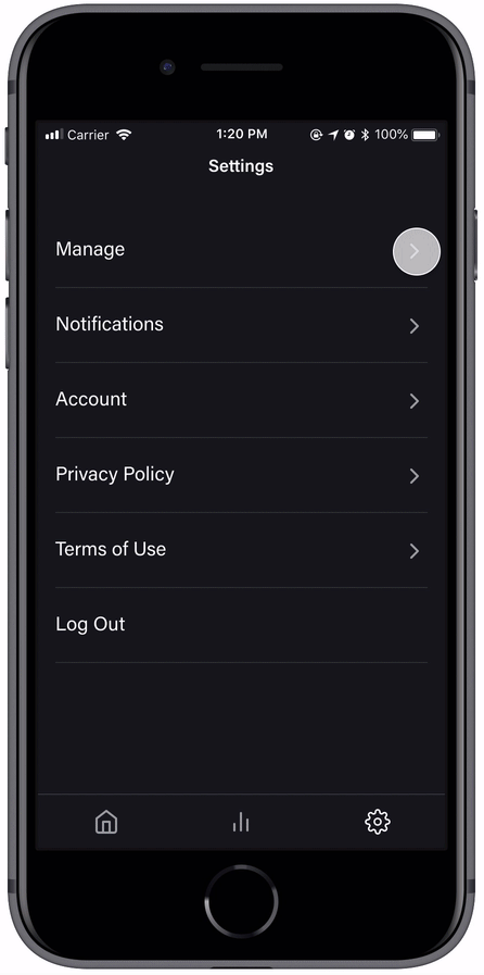
Customizable settings to optimize energy usage
Onboarding and Setup
Dashboard and Trends
Settings
Learnings
Keep digging into the “why”
During this project, I’ve learned to ask deeper questions and find the underlying reasons and motivations behind decisions. This helped pivot our business strategy and design a product that better met the needs of our target users. In addition to leading the end-to-end product design process, I also learned to build a brand identity that aligned with the company’s vision and target market.
If I had more time, I would have conducted additional validation testing with a prototype using sample data, as I think helping users see the numbers changing in real-time would provide us with more valuable feedback.