
Overview
Amazon FreeTime Unlimited is an online subscription that gives kids unlimited access to books, movies, TV shows, educational apps, games, and premium kid’s skills.
I helped Amazon design a solution to increase engagement by improving content discoverability and enhancing the visual design.
The Problem
Kids aren’t engaging due to irrelevant content
Amazon FreeTime provides a wide range of content for kids. Despite the options, the lack of personalization and poor navigation discouraged kids from engaging with the app as it was difficult for kids to find relevant content.
How might we help kids ages 6-9 discover content and engage with FreeTime?

THE SOLUTION
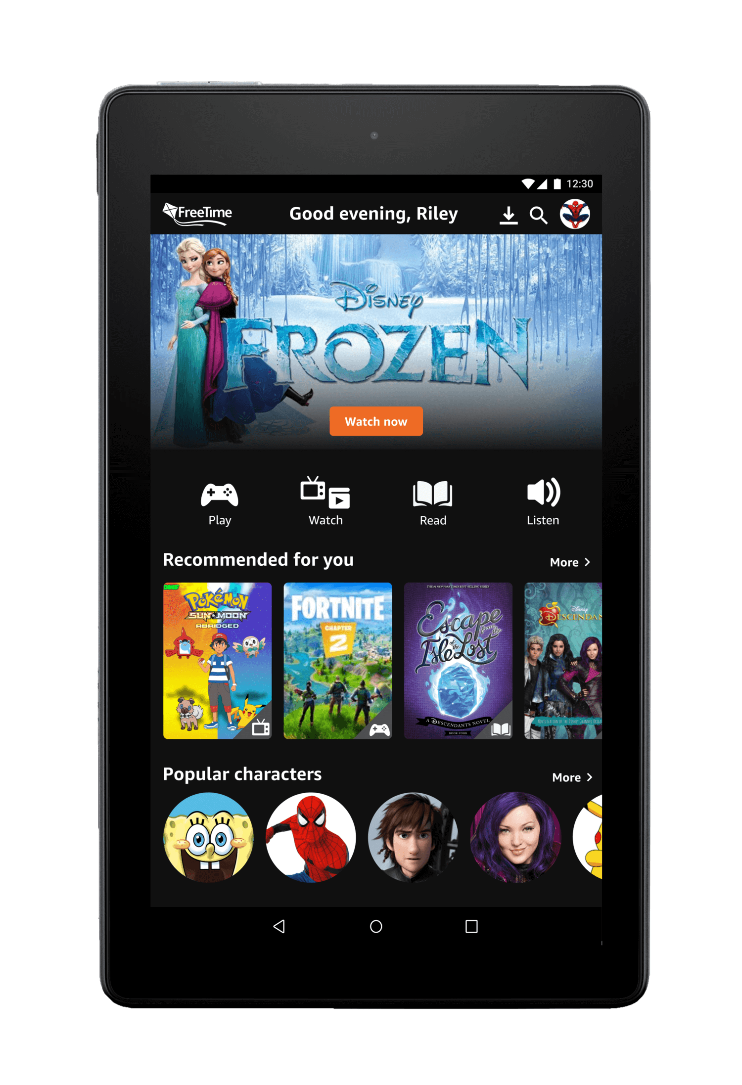
A platform tailored to kids and their interests
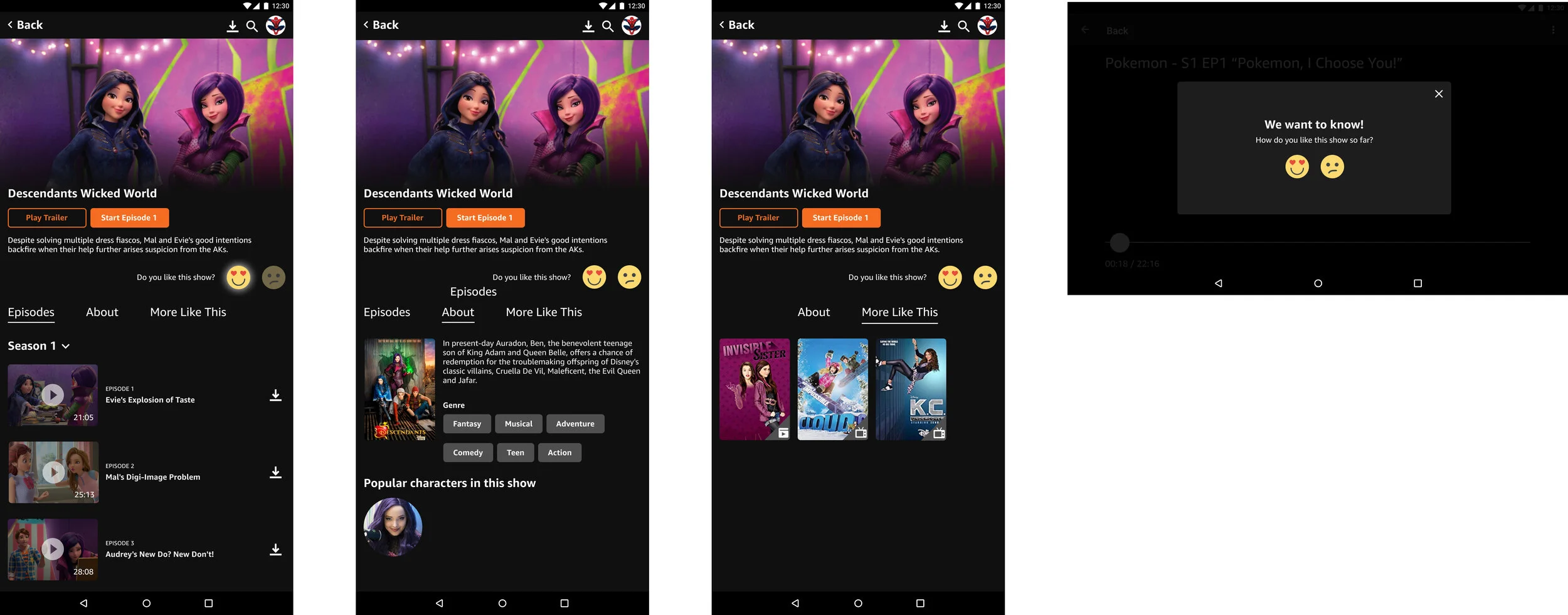
We designed an interface that continually learned and surfaced relevant content to kids by incorporating a rating system using emojis and helped them navigate and identify content using simple and easily understood icons.

Final Designs
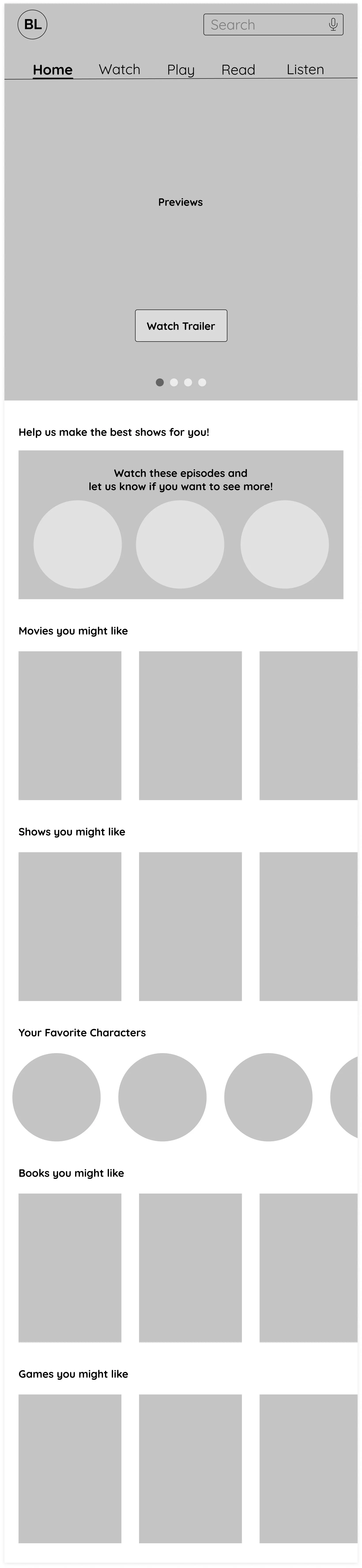
Simple navigation and icons to help kids find content
Kid-friendly rating feature to improve personalization
Easy access to kids' favorite characters
research
Kids have specific content and characters they like
I performed research on several competitors, including Netflix, YouTube, Disney+, Cartoon Network, and Hulu, reviewed research provided by the client, and also spoke to kids to better understand their needs, goals, and pain points. Here are the main takeaways:
Design process
Designing to increase discoverability and engagement
With our key insights from research, we proposed the following design solutions:
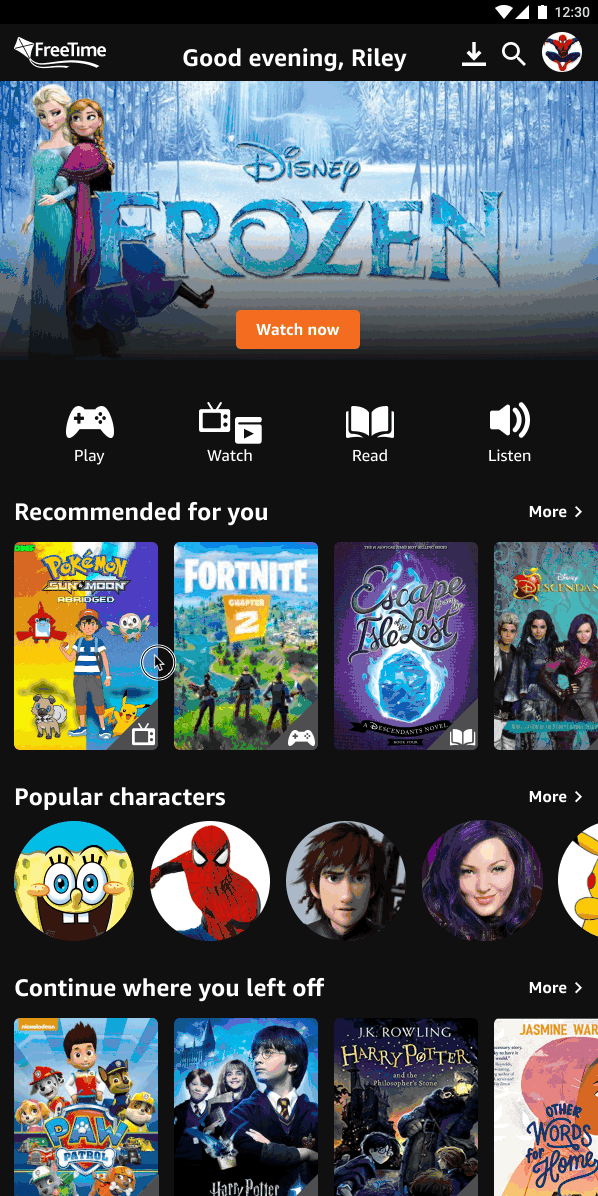
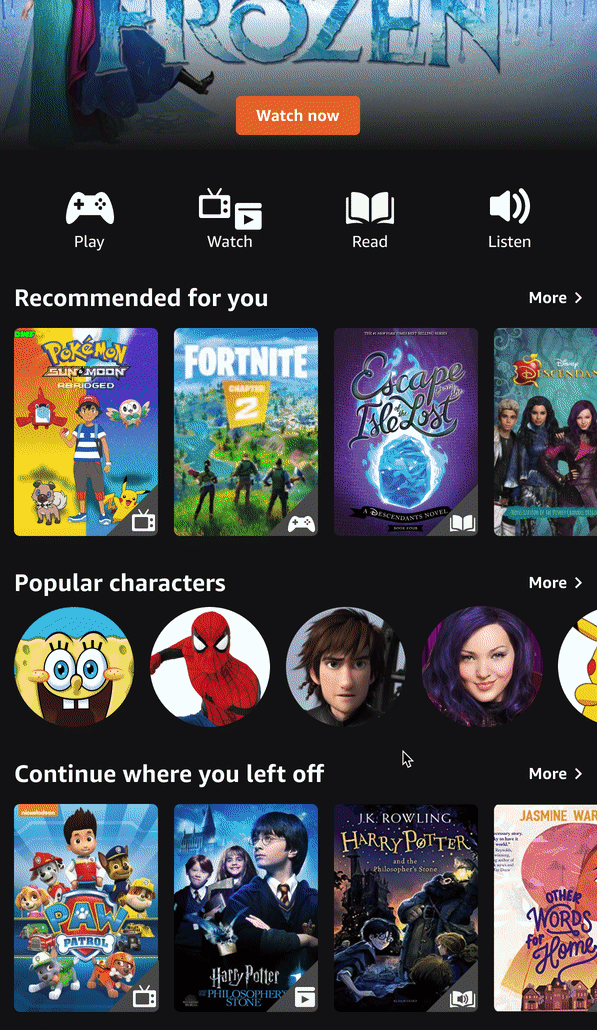
A home page with a simple navigation that prioritizes content to enhance discoverability
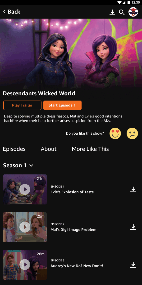
A watch page and flow focused on personalization to improve content suggestions
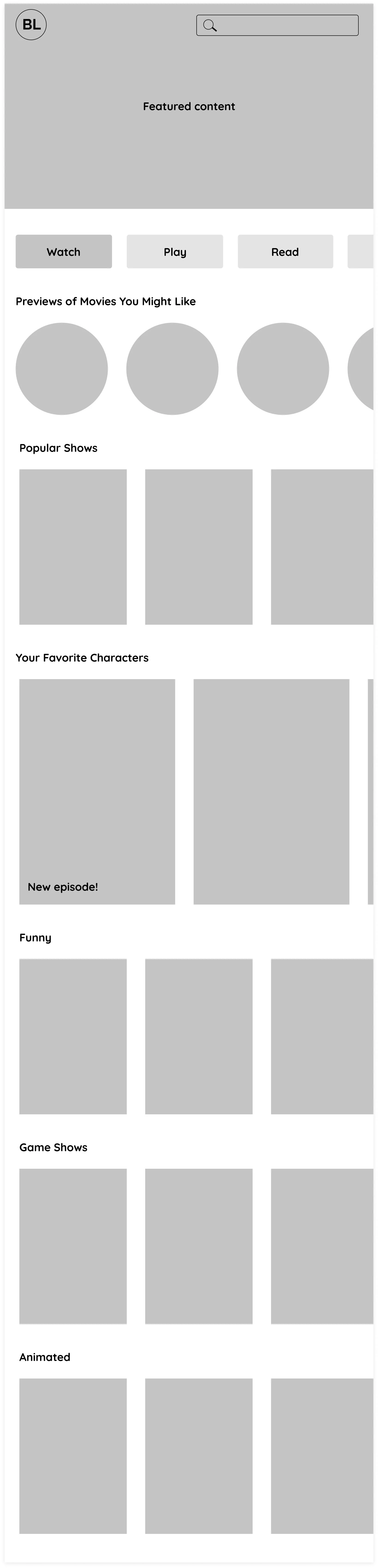
1. Creating a home page focused on helping kids discover content
Iteration 1
Simple, kid-friendly navigation to help quickly identify types of content. A carousel in the hero to highlight various content and increase discoverability.
Iteration 2
A hero featuring one specific content to better guide the user to towards taking action. Button navigation placed below the hero to draw attention towards types of discoverable content.
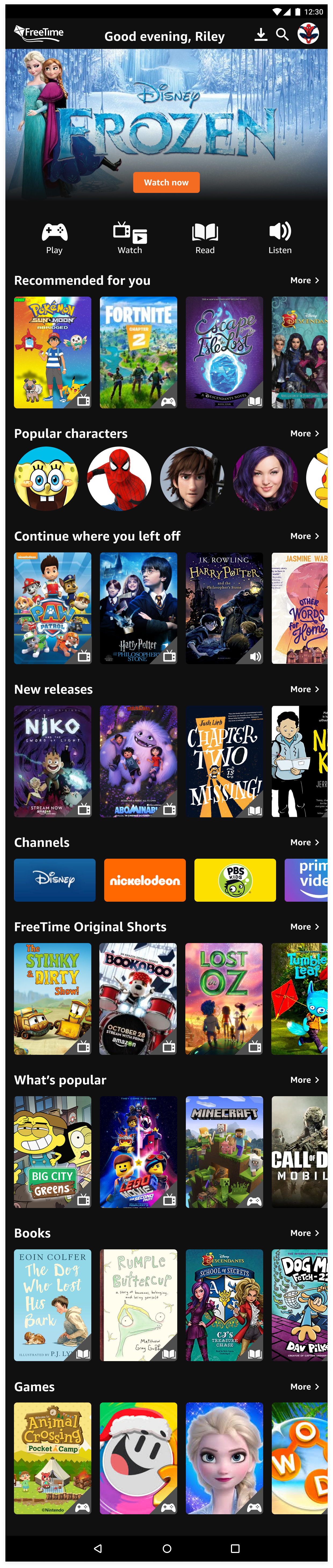
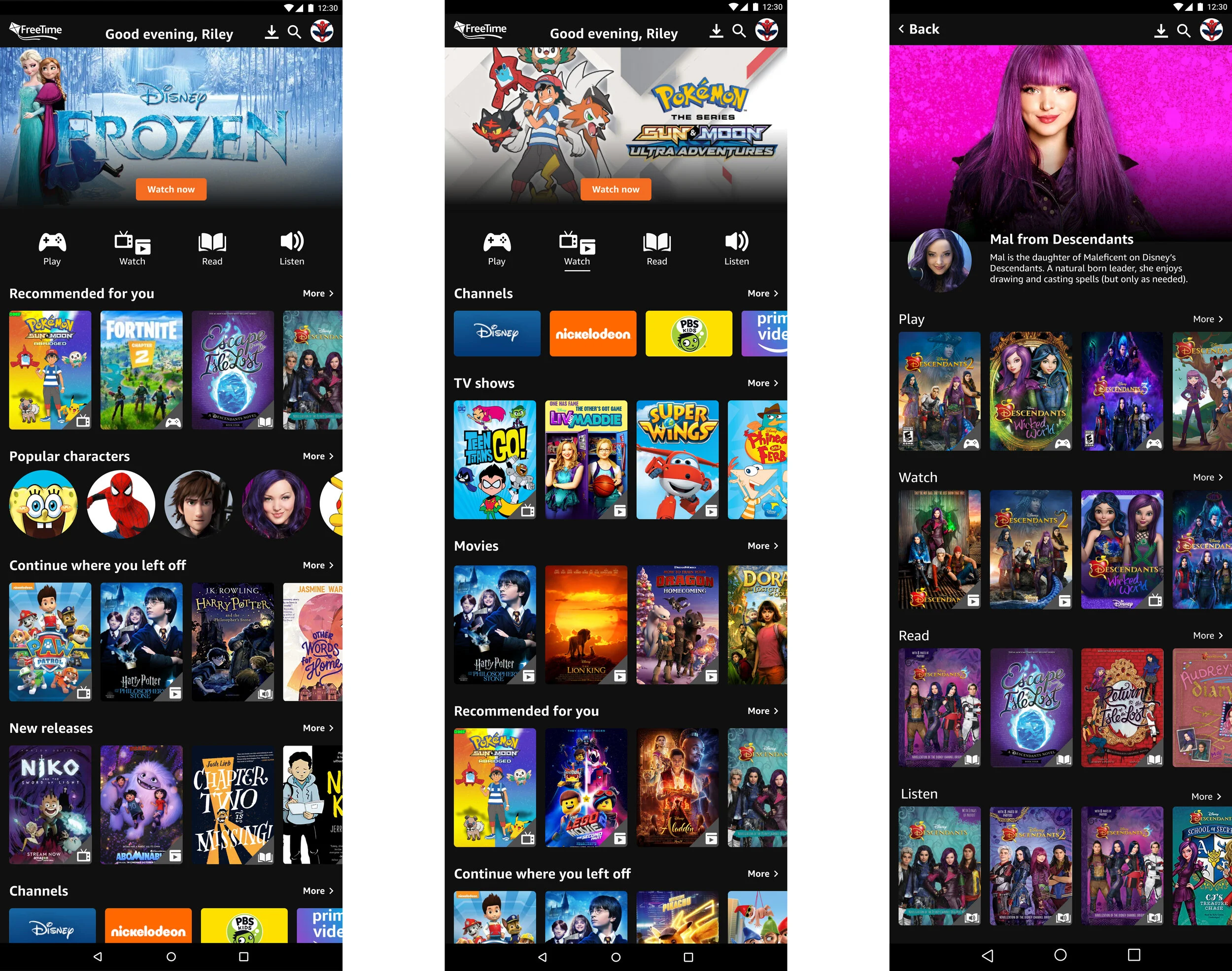
Final Home Page Designs
We decided to take elements from both iterations to design a solution that best addressed the user’s needs. Here are the key elements of the screen:
• A simple hero with a bold CTA to urge the user to take action on the featured content tailored to the user
• Simple, eye-catching icons to help kids quickly identify and scan through types of content
• Recommended for you to enhance discoverability of relevant content
• Characters to help users find content in a personable way

2. Creating watch and character pages focused on surfacing relevant content
Iteration 1
Used a common and familiar like/dislike button to gather feedback to personalize content
Iteration 2
A prompt after watching a show to urge the user to quickly provide feedback
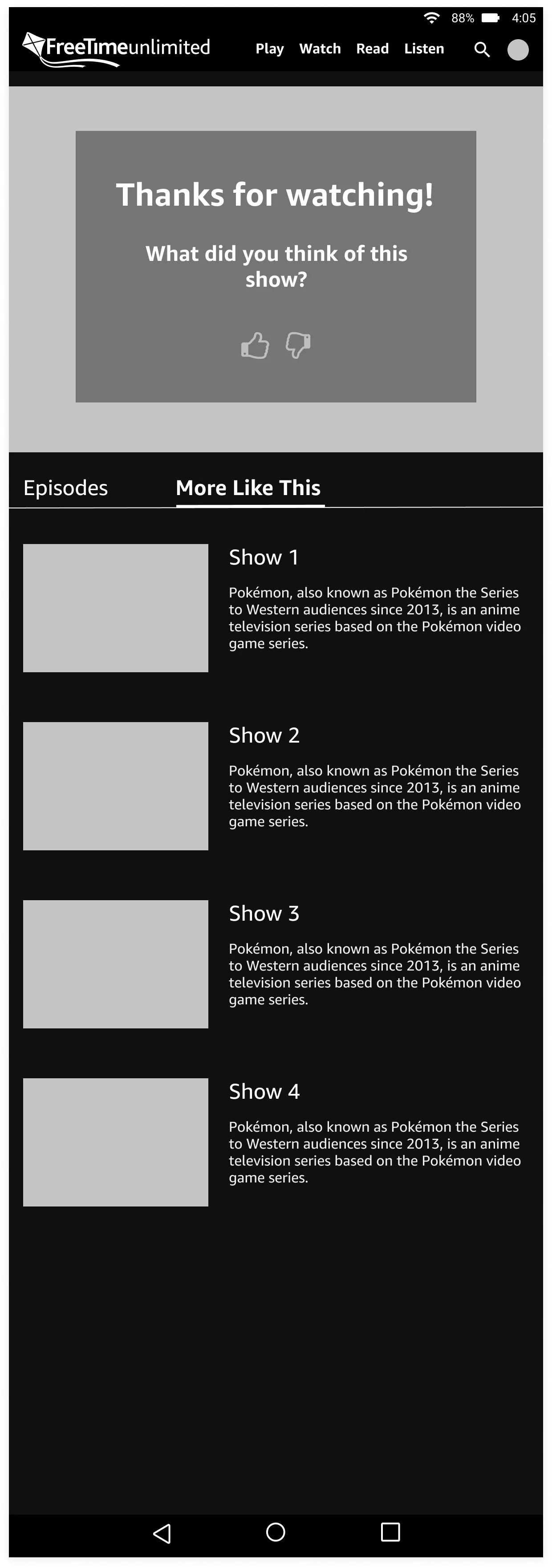
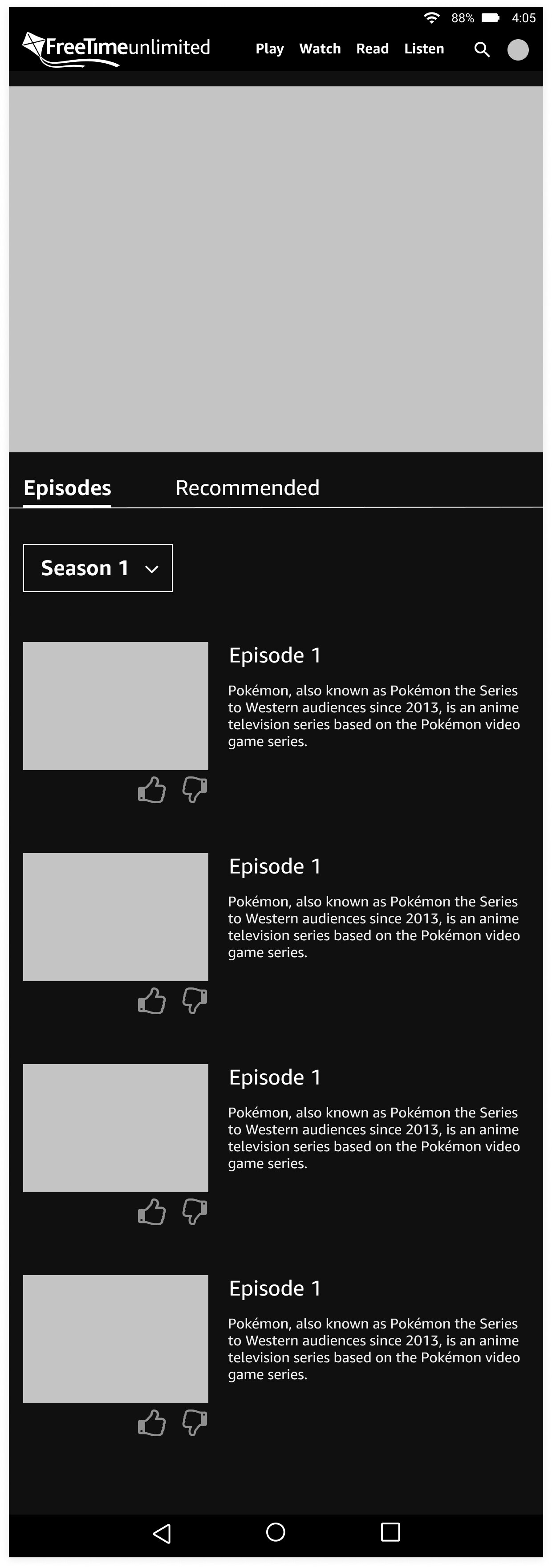
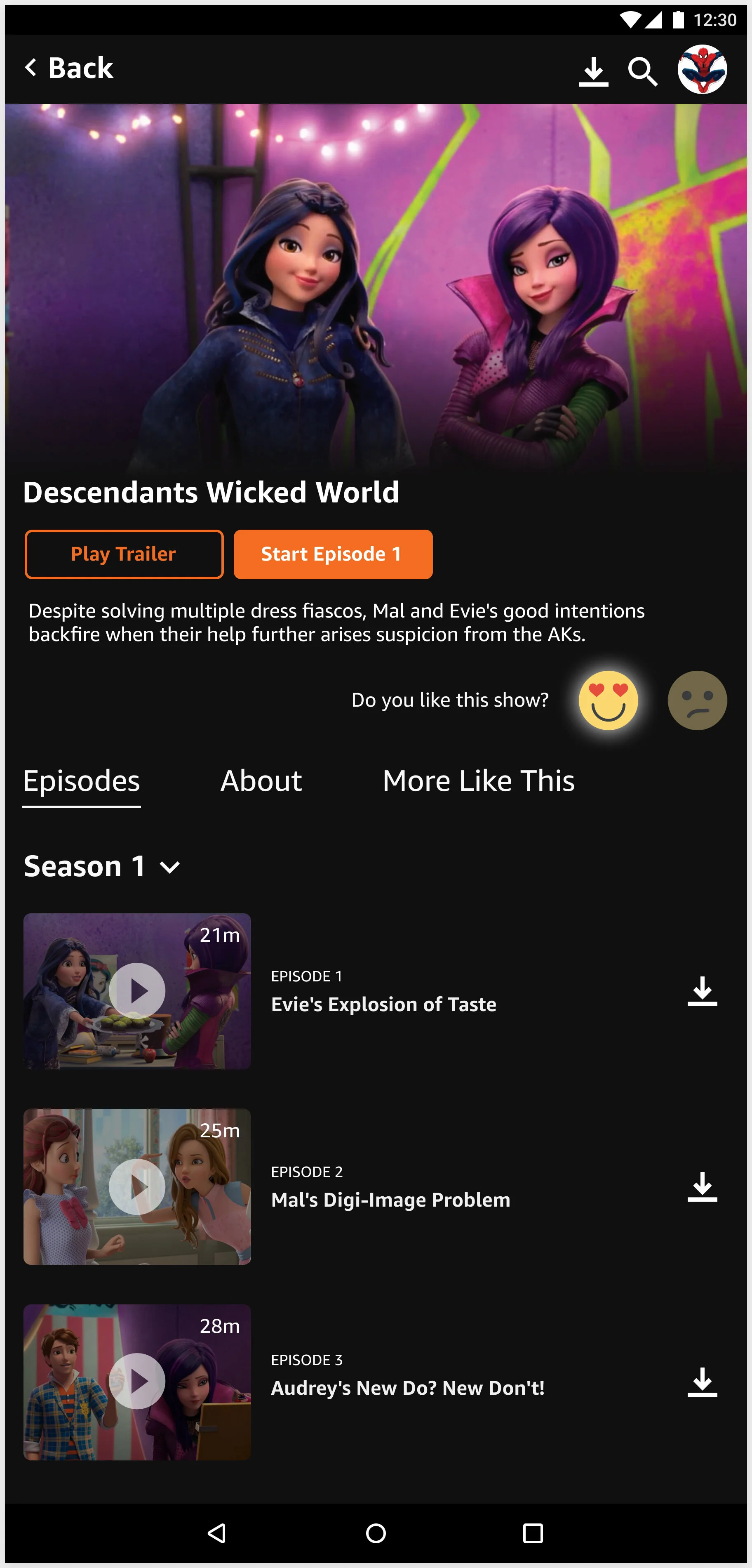
Final Watch Page Designs
We explored several different designs and moved forward with a solution better tailored to kids. Here are the key elements of the screen:
• Emojis as research showed kids respond better to faces and will encourage them to provide feedback at any point in their experience
• More Like This to offer additional content and enhance discoverability
• Minimal text as research showed kids rarely read text and prefer visuals

validation Results
A change in the navigation to enhance discoverability
We conducted validation testing on 7 kids to see if they understood and enjoyed discovering personalized content. Here are the results:
7/7 users could find content based on icons
4/7 users could find content using characters
3/7 users could find the watch page
6/7 users enjoyed and knew how to use the like feature
I discovered that content matters most to 6 to 9 year olds. Kids immediately are drawn to content that they recognize and love. Designs that prioritize relevant content to the user will undoubtedly be more engaging, so the homepage focuses on highlighting personalized content and characters that they love.
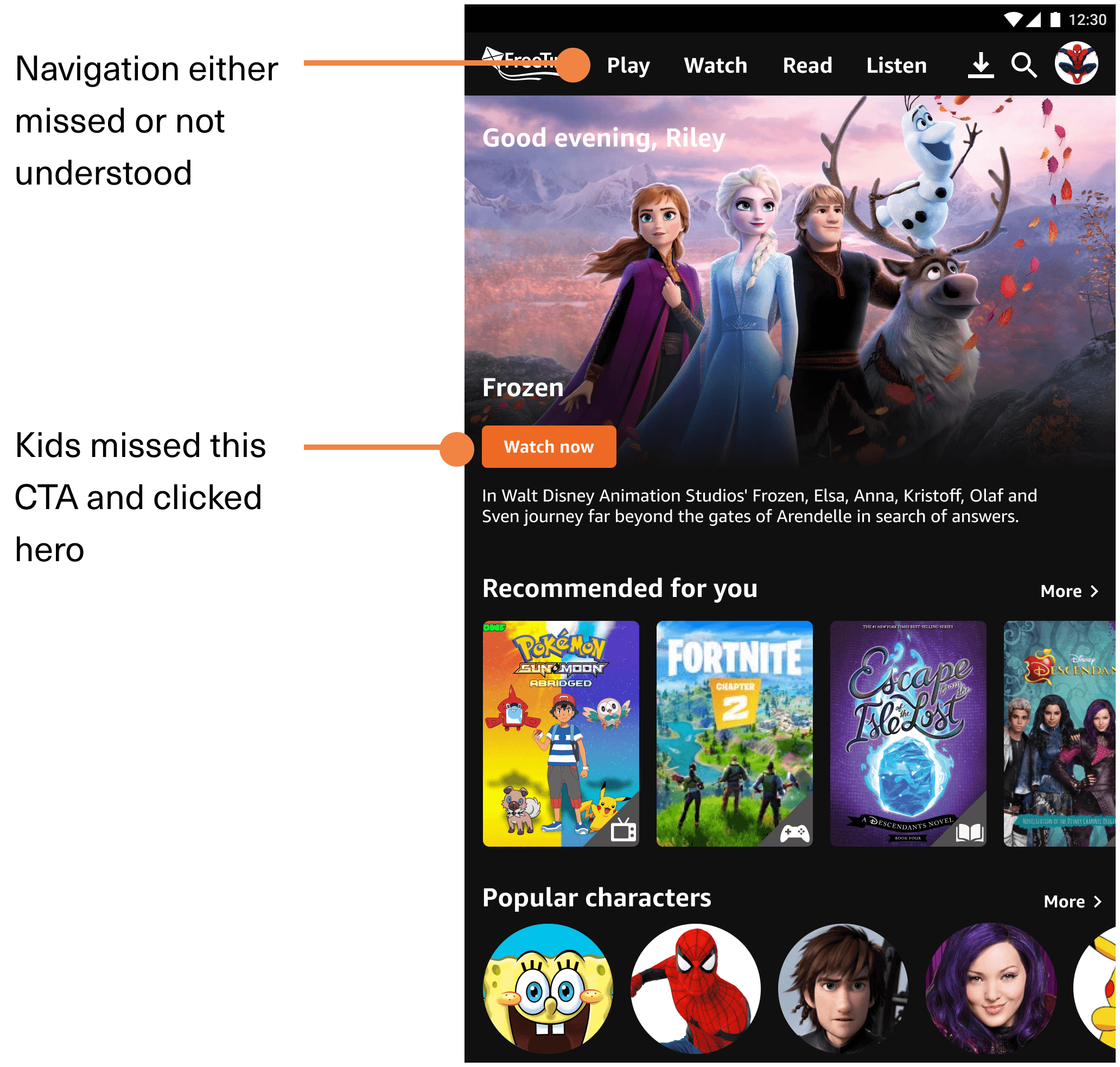
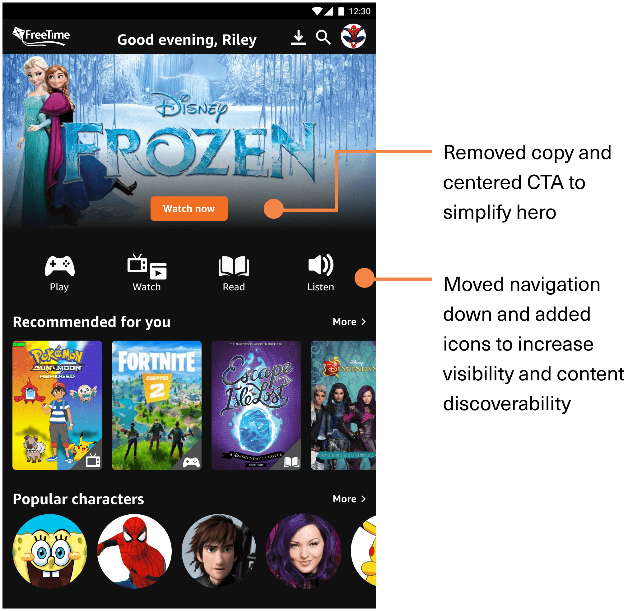
Validation testing provided helpful feedback on the navigation as we discovered kids didn’t see or interact with it and the featured content, so I made the following changes:
Before
After
Final Designs
A discovery experience focused on what kids love
Learnings
Designing for kids requires more intuition verified by data
It was a challenge designing for a young user group. It required patience and flexibility to learn how to interact with kids to receive helpful data that we could use to inform our designs. We supplemented user interviews with additional research and intuition to design our initial solutions and conducted usability testing to validate our designs.